金汤玉露
Client_熹茗茶业
Designer_Bosom
Photography_Hello小方
Time To Market_2017
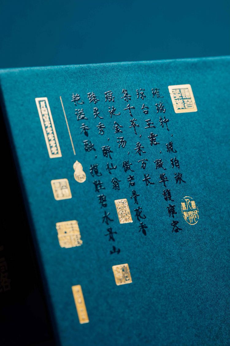
琉璃钟 琥珀浓
琼台玉露 凝华馥雍容
集千萃 采万长
瑶池金汤 傲岩骨花香
臻灵秀 醉仙翁
艳溢香融 揽胜碧水丹山
Glass bell, amber thick
The jade dew of Qiong Tai is elegant and graceful
Gather thousands of people to gather ten thousand
Osseous rosin of golden soup of Yao Chi
Drunken Fairy
Brilliant fragrance melts to win the blue water and rivers and the country
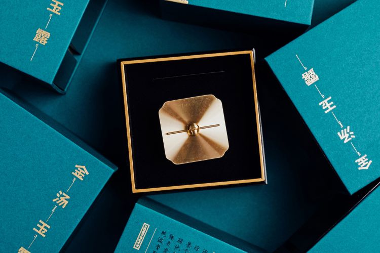
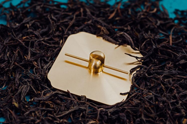
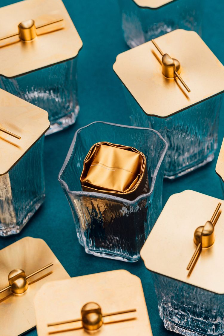
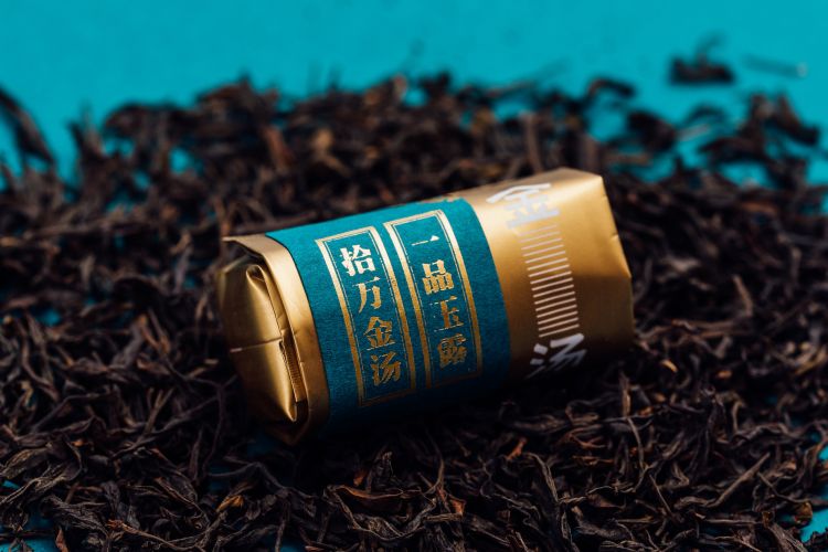
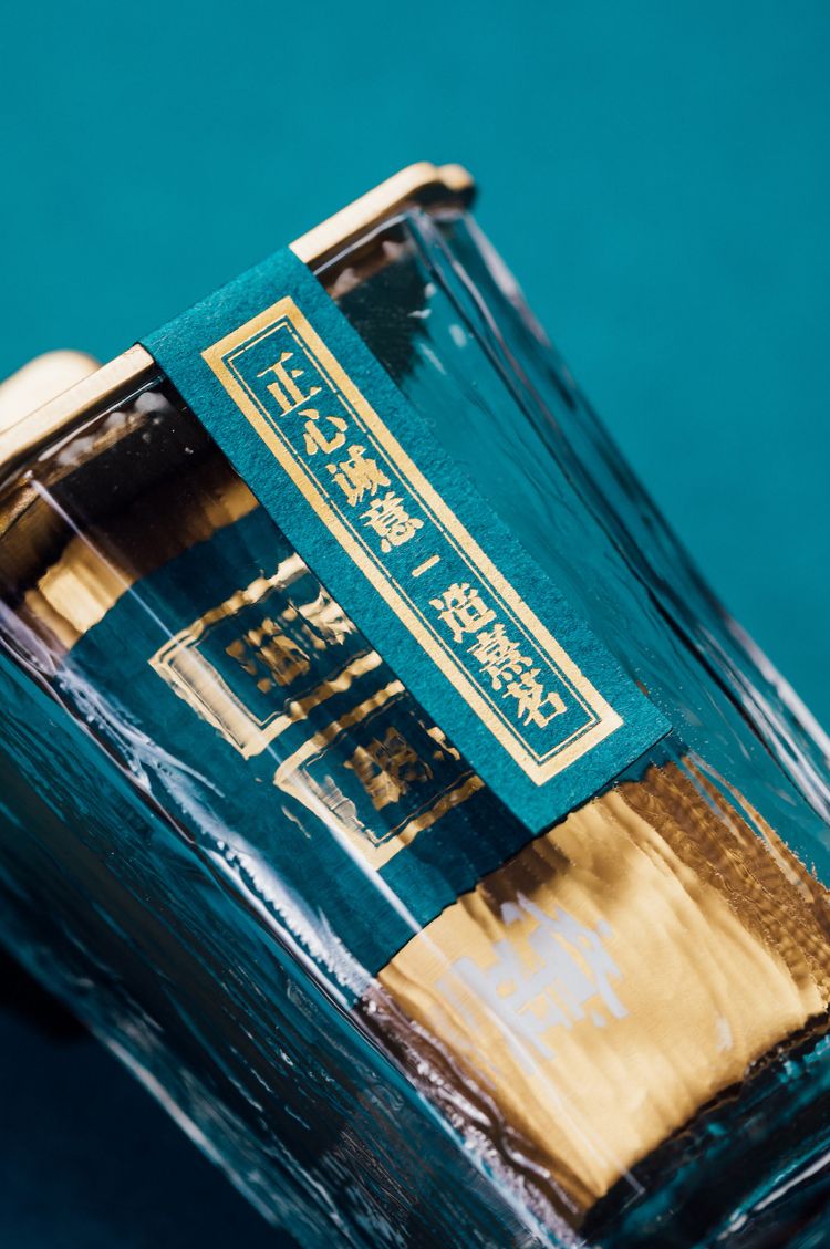
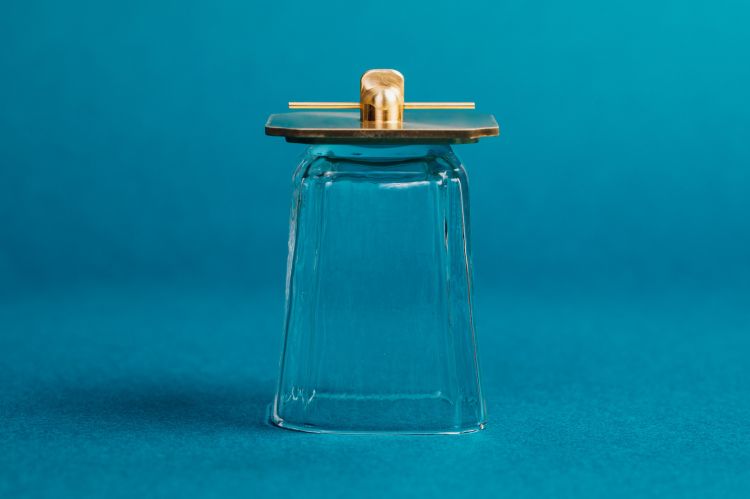
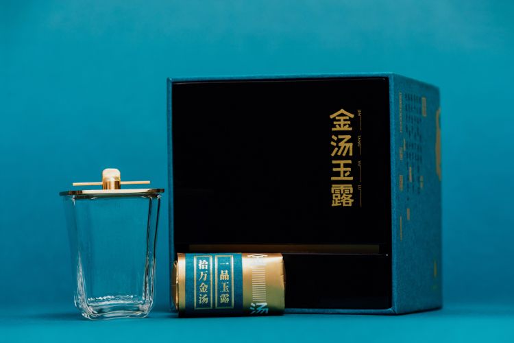
“金汤玉露”集武夷之灵气,采芽叶之精粹,化为琥珀于琼光潋滟杯之中。汤色上金灿诱人,香气四溢。内包装结合了文创产品水晶闻香杯为容器,展示汤色及香气。封盖为朱熹形象延展打造的黄铜官帽,体现贵气及唯一性。容器精致美观可作为个人随身杯,提倡环保理念的同时添加了茶拔架功能可放置茶针茶夹外包装提炼玉玺结构,色系摘自《瑞鹤图》整体呼应呈现着华贵雍容。
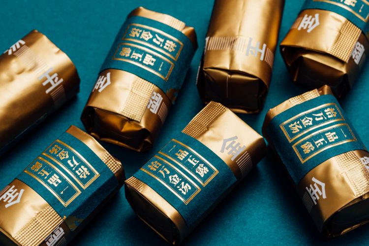
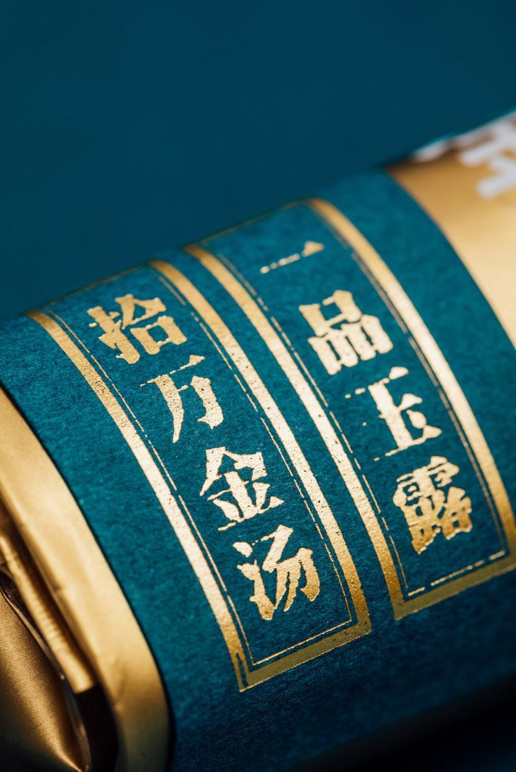
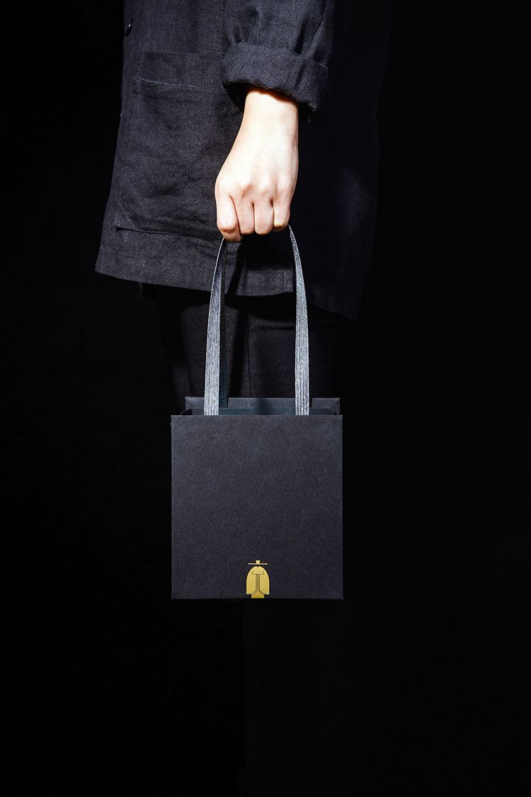
包装细节文案采用宋徽宗的瘦金体,将产品信息巧妙融合于印章中,诗篇般更具整体感。朱熹LOGO立足于盒型底部-理念摘自《道德经》:强大处下,柔弱处上。金汤玉露字标以隶书为基础,设计上融入茶叶叶脉及纹理体现茶行业特性。
It means the attractive soup in gold, suffusing an exquisite fragrance all around.The inner package combines the Creative products of crystal scented cups to show the color and aroma of the soup.The cover is brass hat which is the extension of the litterateur Zhuxi’s character,reflecting gas and uniqueness.The exquisite and beautiful container can be used as a personal carry-on cup, which advocates the environmental protection concept and adds the function of tea pulling frame to place tea needles and tea clips.The outer packing extracts the jade seal’s structure, the color department extracts from the <the red crane> picture, overall echoes and presents the magnificent natural and graceful.
The packaging details are written in style of Chinese calligraphy originated by Emperor Huizong of the Song Dynasty, which skillfully integrates the product information into the seal, making it more integrated like a poem. Zhuxi's logo is based on the bottom of the box, this is a concept from <Tao Te Ching>: “strong at the bottom, weak at the top”. Jin Tang Yu Lu’s logo bases on official script, the design contains veins and textures of tea leaves to embody characteristics of tea industry.

